Saturday, 27 October 2018

The Bowes Museum - Summer 2018


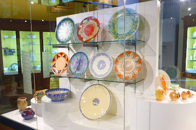
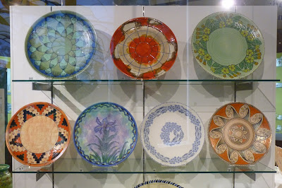
The Charlotte Rhead: Between Art and Industry display at The Bowes Museum has now been dismantled and the items safely returned home. Sad that it is over, but we have been most fortunate in being able to show off part of our collection to a wider audience especially in such a prestigious location. We say a very big thank you to The Bowes Museum for hosting the display and in particular, Howard Coutts, Keeper of Ceramics, who was instrumental in making it all happen and to Catherine Dickinson and Vincent Shawcross for presenting it so beautifully.

We would also like to thank Howard for encouraging Ian to give a short talk on collecting Charlotte Rhead pottery to the Northern Ceramics Society at their meeting on June 20th in The Bowes Museum. It did feel like gate crashing a 17th to 19th century ceramics party but hope a little 20th century content provided an interesting distraction.

In addition, it was most enjoyable being able to produce the booklet to accompany the event and that will always be a fine souvenir of the display. Many thanks to the team at Curious12 in Bishop Auckland and we have no hesitation in recommending them to those searching for help with a design and print project. They exceeded our expectations with their imaginative design flair, advice on printing format and amiable patience with all the proof reading niggles.

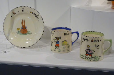
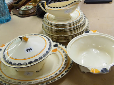
All that remains is to show some pictures of the display especially for Charlotte Rhead enthusiasts who were unable to visit Barnard Castle this summer.

Ian & Margaret

PS  It is only by chance, but the display cabinet being adjacent to the Jacques Gruber stained glass panel is quite striking. The similarities of line and colour between Charlotte’s pottery and Gruber’s leaded glass of a decade earlier, (c.1925) is quite remarkable.

Charlotte Rhead Bowes Museum Exhibition Wisteria Foxglove
Charlotte Rhead Bowes Museum Exhibition
Charlotte Rhead Bowes Museum Exhibition chargers
Charlotte Rhead Bowes Museum Exhibition Stitch
Charlotte Rhead Bowes Museum Exhibition tableware Cotswold

The Bowes Museum links


Booklet preview link & Curious 12


Tuesday, 7 August 2018

Tube-lined base markings other than signatures and tube-liner identifiers

Collectors of Charlotte's tube-lined designs from Crown Ducal may have noticed items where the tube-liner has added numbers, letters or marks other than a Rhead signature or tube-liner identifying mark to the base.

These fall into five categories:
  • Production instructions - tube-lined .K. and .S. marks (and similar)
  • Tube-lined shape numbers
  • Tube-lined pattern numbers
  • Triangles of 3 tube-lined dots
  • And others!

All of these markings must have had a purpose at the time they were applied. Sometimes the purpose is clear such as the pattern number, but it may not be evident why the pattern number was tube-lined on some items and not others. This post is a summary of my thoughts so far on what can be read into these "additional" markings.

The tube-lined .K. mark
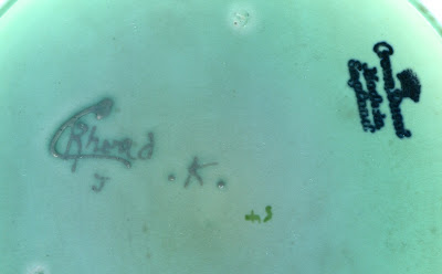
Charlotte Rhead Crown Ducal tube-lined base marks
Tube-lined .K. mark on a Persino pattern 3052 12" charger

Occasionally you may come across a tube-lined letter K with a dot either side, “.K.” on the base. The mark is obviously applied by the tube-lining artist at the time she signed her Rhead signature. There is evidence that it is a message to the enamellers, gilders and lustrers that the pot need to be decorated in a different way to usual. Bernard Bumpus records the K mark as a possible identifier for a tube-liner, but this would not make sense because it is usually accompanied by a known tube-liners mark and therefore must have another purpose.

The single mention of the “.K.” mark in the Crown Ducal pattern books is under the entry for the Green Chain pattern 4298 where there is a pencil notation, “To be marked .K.” I have recorded 7 examples from the original production run of pattern 4298, (AGR2 backstamp style), that have the “.K.” mark. The only other patterns seen to date with the “.K.” mark are Byzantine 2681, (24 examples) and Persino 3052, (13 examples) which are different colourways of the same design.

The possibility that the mark might be to alert the decorators to apply different colours is reasonable because in 1935 both orange and green versions of the Chain pattern, (4100 and 4298), would have been in production. The tube-lining was exactly the same for the two patterns, so instructions would have to be passed somehow as to what colours should be used to fulfil the required client orders.

Unfortunately the theory breaks down because, of the Byzantine/Persino pairing of “.K.” marked pieces the 25 Byzantine pots are decorated in traditional 2681 colours, not 3052 colours. Therefore if the mark was an instruction to the enamellers then the message was ignored most of the time!

This could be resolved by changing the the meaning of the ".K." mark to - ask the supervisor what colours to decorate the pot with because two versions are in production at present - that might work.

Whatever the precise meaning, the general idea still has merit because further study of the pattern books reveal that two other patterns have instructions that they should be marked in a specified manner. These are 4300 and 4318, which are variations of the Tudor Rose pattern. For pattern 4300, the instruction is “To be marked ".B.”, which makes sense as one of the dominant colours in the design is blue. Similarly for pattern 4318 the instruction is “To be marked .O.”, where the dominant colour is orange. It should be said that at the time of writing no examples of Tudor Rose have been seen with a tubelined “.B.” or “.O.”. Please let me know if you have one.

The tube-lined .S. mark

Charlotte Rhead Crown Ducal tube-lined base marks
Tube-lined S mark on a Lotus Leaves pattern 2682 bowl

The “.S.” mark is  more problematic, it can exist with or without the dot marks either side, there is no reference to it in the pattern books and it occurs on a wider range of patterns, sometimes with only a few observations, or a single example. Of the 38 examples seen it is most commonly found on the Lotus Leaves pattern, (2682), Rhodian, (3272) and Trellis, (6016). But also examples are known on patterns 2691, 2801, 3797, 4016, 4040, 5391, 5393, 5802, 5803, 6017 and rare unnumbered trial designs.

Some of these patterns exist in different colourways. For Lotus Leaves most of the ".S." marked items are the rarer green wash variation , (but not exclusively). Several other designs in the list above exist in different colourways, either with the same pattern number or a different one. There is a high proportion of variations to the true designs amongst the ".S." marked items but equally, in many cases it does not appear that the decorators modified the enamelling in any way.

First thoughts are that the ".S." represents an instruction for special colouring since the two colourways of Lotus Leaves are the earliest known colour variation of Charlotte’s Crown Ducal patterns. A single jug in the Turin, (2691) pattern without any enamels has been seen with an S mark.

The next occurrences of S are on Rhodian, (3272), but only one of the five examples has any variation of the design and that is in the green and blue colourway. After that, examples are scarce until the 5391 special blue/mauve mottle glaze pots, (also used for Iris & Floretta patterns). Then two examples on Fruit Border, (5802), only one of which appears different to type with a border motif more akin to Rhodian. There is one example on Palermo, (5803), which is a special variation of the design, (or the original prototype) with two rows of petals, and several on Trellis, (6016), none of which appear to exhibit any variation from type. 

The evidence is not very compelling, the suggestion that these marks were originally devised as codes for alternative colour decoration remains a possibility. Or perhaps the mark meant they were the "Samples" for the Crown Ducal travellers, (sales representatives) to take for showing to clients - but then the range of items seen would seem rather odd with several 2682, 3272 and 6016 but none or very few of the other patterns. It is also worth remembering that "Special" or "Sample" may not relate just to the pattern or a variation in the pattern, but could be about the shape. A handled vase in shape 198 exists in pattern 2801 with an ".S." mark and the AGR2 backstamp. It appears to be the standard Byzantine/Danube design, but this would not have been a new design when it was made. But the shape was new, it only went into production at the beginning of 1935, and so the "Sample" may have been to show off the new shape rather than the pattern itself.

It is probably best just to say it might mean that the pot is destined for a special purpose so that it might be decorated with extra care and be identified, retrieved and set aside at the end of the decorating process for whatever this special purpose might be.

Just to add to all the uncertainty in these matters, one item, (a smokers box in Stitch , 3274) is marked "SS" and a green washed Lotus Leaves jug with green wash is marked "SD". "Special Shape" and "Special Design"  - who knows?

Tube-lined shape numbers
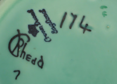
Charlotte Rhead Crown Ducal tube-lined base marks
Tube-lined shape number 174 on a  Primula pattern bowl

The shape number of is often tube-lined on the base of vases and some bowls, but this practice appears to have ceased sometime during 1936. It is not uncommon to find the early patterns and examples of Persian Rose, (4040), or Green Chain, (4298), with the feature but much less so on Tudor Rose, (4491) or Manchu, (4511). No design younger than Manchu has been observed with a shape number tube-lined on the base.

The new shapes that were introduced in 1936 like 209, 211, 212, 213 and 214 all had the shape number moulded within a recessed rectangle quite clearly in the base so that the glaze could not obscure the figures as was often the case with the inscribed shape numbers. It was probably at about this time that it was deemed unnecessary to tube-line the number as well.

This is quite a useful date marker but not a very precise one. Although the new shapes with moulded numbers are almost certainly the trigger to stop tube-lining shape numbers, it is impossible to say if the practice stopped because of a change in policy or it gradually ceased because it was becoming a wasted effort. My thoughts lean to the former scenario because I have only seen one pot from those shape numbers, 209-214, with a tube-lined shape number and that is a shape 209 with pattern 2801. A splendid vase produced late in the production period for the Danube pattern and may possibly have been a special order or one of the first trial pieces to show off the the new large vase shape 209.

Tube-lined pattern numbers
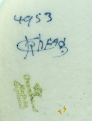
Charlotte Rhead Crown Ducal tube-lined base marks
Tube-lined pattern number 4953 on a Foxglove 12" charger

If shape numbers stopped being tube-lined in 1936 is is almost the opposite story for pattern numbers. In the early 1930s it appears that only slip decorated patterns had tube-lined pattern numbers. These would be the big salad bowls and platters for the USA market and the Blossom design on snow glaze, pattern 4538. If a pattern number is present on any other design it would have been applied by the enameller or lusterer.

Then sometime, in 1936, it becomes more likely that the pattern number is tube-lined for all designs. Certainly observations show that patterns 4921, 4922, 4924, 4926, 4953 and 4954 have a very high chance of having tube-lined pattern numbers. These would all have been promoted strongly at the British Industries Fair in March 1937 so perhaps it was decided with the great surge in orders that it was more efficient for the tube-liners to number the pots rather than the paintresses.

Triangles of 3 tube-lined dots

Charlotte Rhead Crown Ducal tube-lined base marks
Tube-lined 3 dot triangle mark on a Stitch pattern 3274 bowl

These are a fascinating curiosity. I have details of 16 items where there is a small triangle of 3 tube-lined dots on the base, 8 are on Byzantine, 2681, 1 on Lotus Leaves, 2682 and the remaining 7 on Stitch, 3274. The Byzantine and Lotus Leaves pots all have Charlotte's own signature on the base. So can we presume that the triangle of dots mean these pots are the work of Charlotte Rhead, and consequently that Charlotte even mucked in with tube-lining examples of the simple Stitch pattern herself? I believe there has to be a more involved explanation than that otherwise why sign and add the dots as well. 

And Others!

A couple of other marks have been seen. A single example of a tube-lined asterisk and two examples of the the letters ".N.M.". They do not appear to be decorated differently to type so there is not much  point in speculating their meaning.

Monday, 21 May 2018

Charlotte Rhead: Between Art & Industry


Charlotte Rhead: Between Art & Industry
May 26th - September 9th
The Bowes Museum, Barnard Castle

It is less than a week to go and the excitement is building!

This morning the display cabinet was empty, ready and waiting to receive the Charlotte Rhead tube-lined pottery.

Thank you so much to Catherine and Vin, they have done a wonderful job designing and refining the layout to present the pottery at its best.


Charlotte Rhead Crown Ducal Bowes Museum exhibition

Charlotte Rhead Crown Ducal Bowes Museum exhibition

Sunday, 11 March 2018

Period Advertising from New Zealand

The huge amount of scanned newspapers online is a boon for anyone researching the past. Recently I have been searching through the old newspapers of New Zealand and have found lots of fascinating advertisements for Crown Ducal and even a mention of Charlotte Rhead. This post presents some that are useful in helping with the Crown Ducal production history, they have illustrations, names or enough text description to identify patterns and of course the newspapers are dated.

Pattern 1479 Regent shaped tableware


The earliest advertisement I have selected is for pattern 1479 a coloured lithograph design dating to 1927. It was one of the earliest designs to use the Regent shape for tableware. As yet I have not discovered a pattern name for it but it seems to have been quite popular.

The Otago Daily Times 21st November 1928
Copyright owner is Allied Press Ltd
Pattern 1479 on Regent shaped plate

Pattern 2800 Aztec vase by Charlotte Rhead


It is lovely to see the Rhead attribution in this advertisement from the D.I.C. store in Dunedin showcasing items from the British Industries Fair of 1933. It hardly needs pointing out but there is a sketch of a pattern 2800, Aztec shape 152 vase. It is actually quite a rare pattern/shape combination. I have recorded only three such vases for sale during 20 years of observing these things. Perhaps they are all treasured in New Zealand homes.
The Otago Daily Times 16th September 1933
Copyright owner is Allied Press Ltd 

Aztec pattern 2800 on shape 152 vase


Tableware pattern like 2833 on Victory shape in different colours


I am reasonably confident I am on the right track with identifying this pattern. The sketch fits the pattern. The description of yellow border with black inner lines is close, but there is a good chance that the advertisement is describing pattern 2833 in different colours. Perhaps the inverse of the black and yellow example below, but instead with yellow semicircles and black inner band. The pattern number would precede the designs of the surviving pattern books so there is no reference source. It is just a matter of waiting until an example turns up.
The New Zealand Herald 11th July 1935
Copyright owner is NZ News & Media

Pattern 2833
Pattern like 2833 in different colours


Snow glaze coffee set - probably pattern 4626 Yukon


I do not have a picture of a coffee set but my best guess is that this advertisement would be for a coffee set in the Yukon pattern. The centre lithograph is the only contender for an "English posy design"

The Evening Post 7th February 1938
Copyright owner is Fairfax Media

 
Pattern 4626 Yukon


Nine different tableware patterns


One advertisement is a research project in itself. It is for James Smith's, the Wellington department store and has descriptions of 9 Crown Ducal tableware designs, most of which can be identified or at least reduced to a small choice of options.

The Evening Post 23rd August 1938
Copyright owner is Fairfax Media
Taken in order:

"Sheffield" is the undecorated, ivory glazed Sheffield shaped embossed tableware. For those unfamiliar with the Sheffield shape have a look at the Winston Churchill plate - the last item in this post - which an example of a decorated Sheffield plate.

"Ferncroft" is probably pattern number 5196. Cotswold shape, green glaze with the Ferncroft lithograph border. The example illustrated is not part of a dinner set but the glaze, lithograph and pattern number are the same.
Pattern 5196

"Rosalie" is a well known long running pattern for which I have never found a pattern number. The Rosalie transfer is usually found on the Florentine embossed ivory tableware shape and with a gold edge. I have written about this pattern in a previous post. https://rhead-crownducal.blogspot.co.uk/2013/10/crown-ducal-period-advertising.html

"India Tree" lithograph pattern on Avon, Windsor and Ionic shapes with snow glaze is the one in the photograph. It is pattern number 4802.

Pattern 4802 large plate

"Classic" is a little trickier. I have not found this pattern name in Crown Ducal documents, but the description of  'cobalt blue with richly embossed gold border' reduces the options to probably either pattern 5055 "Admiral" or 5056 "Colfax". They are very similar, Avon shape with white glaze. Admiral has a gold inner line whereas Colfax has a gold paste printed inner border.
Patterns 5055 Admiral (top) and 5056 Colfax (bottom)

"Majestic" is another unfamiliar name, but the description, 'powder blue with richly embossed gold border and colourful centre piece of casket of roses", means it is either pattern 5080/81 or 5304. Again, they are very similar, Avon shape with white glaze, the floral centre is the Roma circular lithograph designed by William Johnson. The ambiguity over 5080/81is because 5080 meets the description in the pattern book with powder blue band whereas 5081 has powder pink band but all examples seen seem to have had 5081 on the base whatever the colour.  5080/81 has the powder blue colour extending to a large central lithograph, whereas 5304, has a narrower band and smaller central lithograph so that a large area of the plate is white glaze.
Pattern 5081

"Dawn" is also an unfamiliar name. I believe it may be pattern 5195, Cotswold shape, with yellow glaze and the Ludlow border lithograph. There were several patterns created using either the yellow or green glaze and having previously popular lithographic borders most of which include scarlet flowers and green leaves. The Ferncroft mentioned above is from this group of patterns. The picture below is the Ludlow border on ivory glaze to show the lithograph design. The way it might be used for "Dawn" is likely to be different with the border applied to the outside rim of the cups.

"Dawn" is probably the Ludlow border illustrated here but with yellow glaze


"Madeira" Is an as yet unidentified pattern. But I would propose that it might be pattern 5101 with a green band. The picture below is pattern 5101 with a blue band and is known as "Concord". Pattern 5102 is very similar but with a second gold paste band beneath the coloured stripe. Both patterns are recorded in the pattern book as having been made with green bands but I have yet to see an example.

Madeira may be like pattern 5101 but with a green band.

"Oxford" The Crown Ducal name Oxford is reserved for a maroon version of 5056 Colfax mentioned above under the "Classic" pattern notes. Since the advertisement suggests it matches the "Majestic" dinner service but without mention of the floral lithograph then the best match would be either the powder blue version of 5055 "Admiral" which would be named "Galway" or the the powder blue version of 5056 "Colfax" which would be "Ashley".

Pattern 5187 cake plate with pictorial print and enamel centre


This is one of  the many print and enamel centred cake plate designs that were produced for Gainsborough and Florentine embossed plates. They rarely appear in the UK but seem more common in New Zealand. This description forms part of another advertisement for the James Smith's store.

The Evening Post 25th August 1938
Copyright owner is Fairfax Media

Pattern 5187 on Gainsborough shape cake plate

Pattern 4794 Kashmere


It is an awful picture, but there is no doubt that there is a Charlotte Rhead tube-lined vase, shape 213, in the Kashmere pattern 4794 in this advertisement. The jug and other vase, (shape 212), are described as in autumn tonings but the image does not give a clue as what the patterns might be.

The Press 11th November 1938
Copyright owner is Fairfax Media
Kashmere pattern 4794 on shape 213 vase

Pattern 5540 Pansy chintz


From its earliest days Crown Ducal always had one or two chintz patterns on sale and the 1930s and 40s were no exception. The Pansy Chintz, pattern 5540 was introduced in 1938 and some variations of it with combined with gold floral prints either on the rim or in the centre became quite popular in New Zealand in the 1940s. This advertisement would be referring to the the original pattern.

Lake Wakatip Mail 11 July 1939
Pattern 5540 Pansy Chintz

Patterns 5800 and 5801 with Delamere print


Here we have another nicely illustrated print design with coloured washband. The Crown Ducal name for the print is Delamere, the name given to its first use pattern 5647. These later versions are named "Juliet" in green, (5800), and "Miranda" in fawn, (5801), on the Avon shape tableware. They were designed in early 1939 and so like some of the other lines it takes about a year for, the showcasing, ordering, manufacturing, distribution and local advertising to run its course.

The New Zealand Herald 7th March 1940
Copyright owner is NZ News & Media

Delamere print on Avon shaped tableware Juliet in green (5800) and Miranda in fawn (5801)


Pattern 6356 Winston Churchill cake plate with photographic print centre


The Winston Churchill plate is one of the last designs to be recorded in the pattern book before war time restrictions brought pottery decorating to a virtual standstill. The pattern number is 6356 and the last pattern entry is 6367. The printed image of Winston Churchill is believed to be created from a photograph taken by Cecil Beaton at 10 Downing Street on 20th November 1940. The embossed plate style comes from the Sheffield tableware range but examples can also be found on square plates from the Florentine tableware range.

The Otago Daily Times 3rd August 1942
Copyright owner is Allied Press Ltd 

Pattern 6356 Printed Churchill photograph on Sheffield shape plate

End note


There are plenty more Crown Ducal advertisements to document from this period, particularly yellow or green glazed tableware which seems to have been very popular. The difficulty is that a lot of it was not decorated with enamels or lithographs and the Crown Ducal pattern books are useless when it comes to recording these plainer designs. And, since they did not pass through the hands of enamelers there are no pattern numbers on the base. For example, there are advertisements for the salad or crinkle ware, Queen Anne shape and Cotswold shape in either yellow or green and stitched edge Cotswold tableware in these colours too. The only advertisements I am confident of linking with known numbered patterns are the yellow or green glaze Queen Anne and Cotswold shaped tableware with wide gold edge bands. These are patterns 5082, (green) and 5083, (yellow). The company appears to have used the same pattern number for both shapes.

Friday, 26 January 2018

Facsimile signatures. Part 2, Fanny Morrey

It is time to return to the subject of facsimile signature styles. It is more than 3 years since I started with the “easy ones” of Rose, Hannah and Elsie?

https://rhead-crownducal.blogspot.co.uk/2014/07/charlotte-rhead-facsimile-signatures.html

I believe my reasoning for what I wrote then still stands true. The statistics might have changed with more observations, but not in any significant way. Since then Gerrard Shaw has provided new information in his book on Crown Ducal Ware of 2015, with additional names and some employment dates. But with no links between these names and the pottery markings it has actually made my project harder!

My plan here is to significantly reduce the list of anonymous signature styles and ascribe several to Fanny Morrey in the hope that what is left will be easier to untangle.


Composite of proposed series of tube-lined marks by Fanny Morrey starting with the oldest at the top and the youngest at the bottom. The three forming a cross are styles from 1935-1936 which form a cluster where the sequence cannot be unravelled with confidence.
This constructed history of Fanny Morrey’s signature styles is all speculation. It is based on the premise that she changed her signature style throughout her time tube-lining Crown Ducal ware. The styles usually have similarities to the signature which is typically associated with the letter F and which collectors assume to be her mark.

For those who want the simple answer at the beginning, then Fanny Morrey tube-lined all items marked with an F, a DOT, or a 2, (except those 2's defined as being the work of Elsie Fearns? in the previous facsimile signature post).

These various styles also have to fit with information researched by Bumpus that Fanny was a very experienced tube-liner previously employed by Moorcroft and who may have joined Richardson’s sometime around 1933. Also, Shaw provides information that Fanny was with the company from 1932 until after WW2, but that she came with Charlotte from Burgess & Leigh. Although it would be good to know Fanny’s history prior to coming to Richardson’s it is not relevant to identifying her Crown Ducal work. It may well be that she worked at both Moorcroft and Burgess & Leigh; after all, Charlotte had worked at many potteries before 1932.


TL-FM5
Working backwards in time from her standard signature with the letter F it is important to note that this style, (TL-FM5), was not used until the patterns Tudor Rose, (4491), and Manchu, (4511), were well into their second year of production in 1937. Clearly, if Fanny joined the Crown Ducal team in 1932-33 there are going to be hundreds of examples her work with earlier designs and marked with different tubed base marks.

TL-FM4a, TM-FM4b, TL-FM4c left to right with 4a possibly the oldest and 4c the youngest.
So how did Fanny identify her work before her TL-FM5 mark?  There are several variations that are a cross between Charlotte’s own signature and Fanny’s. That is to say they all use the L for Lottie, but this collective group named TL-FM4, can have the letters E and A either both upper case or both lower case and the letter D can have the top horizontal line or not. In addition most are associated with the tube-lined number 2 rather than the letter F.

I have subdivided TL-FM4 based on their differences and think I have the sequence correct. However, it is a struggle to explain the distribution for all this diversity in how Fanny marked her work at this time. Perhaps future discoveries may require the sequence to be revised.

TL-FM3
One indisputable feature is that 66% of the pattern Orange Chain, (4100), items are marked with proposed versions of Fanny’s signature, and 50% are with the TL-FM3 style. For some reason she made this pattern her own. Pattern 4100 was designed at the end of 1934, so it would be reasonable to date that signature style to the end 1934 and early 1935.

Both Bernard Bumpus and Gerrard Shaw mention that Fanny Morrey was an already experienced tube-liner and that she came to work with Charlotte around 1932-33. This was a time when no Lottie Rhead signatures with an L instead of a C were applied, (except those by Charlotte herself). If Fanny joined in 1932-33 she must have used an alternative signature style, or styles, with a C for Charlotte.

TL-FM2
Fortunately there are two that fit the missing time period from the beginning of tube-lined production up to the end of 1934. The youngest pattern seen to date with the younger of these two styles is 4100. It does require a leap of faith to say that TL-FM2 and TL-FM3 are the marks of the same person. If one looks at the letters “h.e.a.d” of the TL-FM2 signature style and the lower case versions TL-FM4 and TL-FM5 they are as close a match as you could expect.

Importantly, the style of the number 2 is quite consistent amongst the different versions with a strong baseline, and is unlike the 2 used by Elsie Fearns?, which can often look like the number 7. In further support that this period 1 or early period 2 style, (TL-FM2), belongs to Fanny, is the observation that over 60% of Omar, (pattern 4036), items were tube-lined by this artist. It seems reasonable that one of the most complicated of Charlotte's designs would be tube-lined by a senior tube-liner. In fact Omar can be found with several different signature styles, (TL-FM2, TL-FM3, TL-FM4 or TL-FM5). My proposal for Fanny’s signature history means that she tube-lined them all. With this scheme I have yet to see an example of Omar tubed by anyone else.

Although the TL-FM2 signature exists on Byzantine examples from period 1, the earliest production period, there is a problem in that there are not enough period 1 examples. That is to say, Rose, Dora and Adams? were significantly more productive than Fanny based on only the TL-FM2 mark. If we are to believe Bumpus and Shaw that Fanny was there at the beginning we need yet another signature style to increase her work output from the earliest days.

TL-FM1
TL–FM1 is proposed as Fanny Morrey’s earliest signature style for Crown Ducal. The script is very similar to TL-FM2 but the C and the underline is more curved but it is usually accompanied with the characteristic number 2 mark. Adding together TL-FM1 and TL-FM2 production gets close to the period 1 output of Fanny’s colleagues. I believe her slightly lower productivity may be because she concentrated on the more complex designs and rarely worked on Lotus Leaves, Turin or Aztec.

TL-FM6
To end this story it is necessary to identify Fanny’s contribution after the WW2 restrictions on decorated pottery came into force in the summer of 1942 and after Charlotte herself had left the company. In his book, Gerrard Shaw notes that Fanny was working as a tube-liner after WW2, but there is no evidence that items marked with a tube-lined F were produced after the summer of 1942. If Fanny was tube-lining for Crown Ducal after Charlotte had left the company the only possibility is that she adopted the DOT mark which I will refer to as TL-FM6, instead of using F. There are no other marks that could signify her work. The other marks on post war items such as L, 11 and 111, are those that were in use by colleagues working while she was using the F mark.

Below are all of Fanny Morrey's observed output presented as histograms at the time of writing with the exception of unnumbered experimental designs. Also, items on small and awkward shapes are not included as these are difficult to fit into this chronology based on periods 1 to 6.  The history has been divided into two, one covering periods 1 and 2, and the other periods 3 to 6.You will probably need to click on them to open a larger version to make it legible.


Periods 1 & 2
Fanny Morrey's production history as observed until December 2017 grouped by backstamp defined period, facsimile signature style.

Periods 3, 4, 5 & 6
Fanny Morrey's production history as observed until December 2017 grouped by backstamp defined period, facsimile signature style.
Here is an attempt to date these different signature styles. It comes with my usual warning that they can only be a guide. There is no historical record of the tube-liners production history or their marks.

TL-FM1    Startup until early summer 1933
TL-FM2    Early summer 1933 until early 1935
TL-FM3    Early 1935 until late spring 1935
TL-FM4    Late spring 1935 until early 1937
TL-FM5    Early 1937 until mid 1942
TL-FM6    From mid 1942 onward, probably until mid-late 1950's

There are some loose ends to tidy up. There exist a few examples of Golden Leaves pattern 4921, with the period 2, AGR2 backstamp, unsigned but with a DOT mark. There are some Hydrangea table lamps, too awkward for any backstamp apart from the basic “MADE IN ENGLAND”, AGR8 style, also with DOT marks. These observations at first appear contrary to the rules of this proposed classification – suggesting there was a tube-liner “DOT” active in the mid 1930s. But I believe that this supports the case for the DOT mark to belong to Fanny Morrey as it links the post WW2 era to that of pre-WW2. With regard to the table lamps, there was no space for the signature, for Golden Leaves it may just have been pressure of work and a way to save time. In the scheme of things Fanny did not tube-line many items of Golden Leaves, so perhaps this is her venting her frustration at being sidelined from her usual task of working on the more difficult Florian, Carnation, Foxglove or Wisteria designs. The problem is easily solved by understanding that Fanny already had her abbreviated mark ready to use when needed and when the tube-liners were told to stop signing their work she reverted to using the DOT as she had used before.

I would like to suggest an explanation for the strange TL-FM3 style. It has capital letters E and A that interrupt the otherwise gradual evolution of Fanny’s signature. In fact it is a almost a copy of Charlotte's own signature, and the one that was used by the tube-liners at Burgess & Leigh. This may have been a problem for Charlotte. I propose that at some time around the introduction of pattern 4100 Fanny Morrey was given permission to sign L Rhead, (for Lottie Rhead), either as a symbol of seniority or friendship. However, this style TL-FM3 was so close to Charlotte's own signature that perhaps she was asked to modify it and after trying various options, which I have grouped as TL-FM4, it eventually stabilised as TL-FM5.

Another unusual sighting is that of a large salad bowl in pattern 3170, one of the USA designs drawn entirely in slip clay. It is the only example I have seen with the tubed mark 2 for Fanny without a signature. There are lots of pots with the F mark and no signature but only this one sighting of an unsigned earlier item of her work. These bowls would have been made when Fanny was using her TL-FM2 style, if it had been signed.

Also, I should mention that for statistical purposes in the histogram I include in the group TL-FM5, all the unsigned items that carry a tube-lined F mark as I assume they were made during the same time range as the signed items with an F mark.

I am hoping that the logic of all this does not come across as total fantasy. It seems to me to be a good way to reconcile the biographical research of Bernard Bumpus and Gerrard Shaw together with the observations of hundreds of base markings.