Friday, 9 May 2014

Crown Ducal backstamps. Part 3, from the mid/late 1930s until 1952


Here we have part three of my Crown Ducal backstamp styles research. This section documents the styles used from before the start of WW2 until the end of the UK restrictions on decorated pottery in 1952.

As in the previous sections, I have numbered the backstamp styles for my own cataloguing purposes and they do not reference the work of anyone else. Also the usual caveats apply that this is a work in progress based on observations rather than documentary evidence - of which I haven't found any of use.

Part 1 approx 1915-1929

Part 2 approx 1929-1936
http://rhead-crownducal.blogspot.co.uk/2013/07/crown-ducal-backstamps-part-2-mostly.html

Through the mid 1930s until around 1938 the company had a quite simple regime of using mostly printed backstamp styles according to the tableware shape range, design style or a standard stamp for their fancies. Then during the summer of 1936 more styles start to appear. I ended part 2 of the backstamp blog with a special printed style for Charlotte Rheads snow glaze tableware. 

From 1936 there were some more new backstamp styles introduced. The plain little MADE IN ENGLAND, type 401, is believed to have originally been created to replace the use of type 110 on small or awkward shaped items. The company continued to use the 1920s style on lamps and small condiment dishes up until the end of 1935 as witnessed by its use on Charlotte Rhead patterns Orange Chain, (4100), and Tudor Rose, (4491). From 1936 onward the lamps tend to get marked with the backstamp type 401.
Type 401

A special version of this simple backstamp, type 402, was created for mugs designed for the Coronation of Edward VIII. The short mugs have REGD. NO. 813982 and the tall mugs REGD. NO. 813982.


Type 402

Sometime in 1939 when Charlottes Persian Leaf, (5391) and Caliph, (5411), patterns are in full production there is a short period when the simple MADE IN ENGLAND, type 401, gets put on any shape of Rhead tube-lined pattern and a lot of tableware too. I have never understood why the company produced ware without their own company name or trade mark on it. WW2 was approaching so there is a strong possibility that all sorts of upheavals were occurring for businesses. Perhaps the employees who made the base mark prints joined the war effort and Richardsons just had to carry on with the staff and materials they had to hand to continue production.
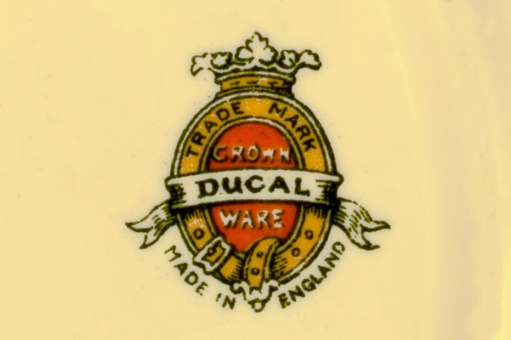
Type 411
Again, in 1936 another backstamp design, (type 411), was produced, this time a self coloured lithograph, (transfer), and was applied mostly to their white glazed Avon range tableware. The general style of this backstamp will be familiar to those who have seen very early Crown Ducal ware, and I described many versions of the strap and buckle style in my blog on backstamps – part 1. The style presented here is distinctly different for many reasons but the most obvious is the addition of MADE IN ENGLAND that follows the bottom curvature of the strap. This is a characteristic of all the strap and buckle designs from the mid 1930s onwards.

Type 412
The Empress pattern, (4746), would be a good example of one of the earlier designs that used it, but any Avon shaped ware, typically with coloured bands, floral transfers and printed repeating motif borders in gold are likely to have this style. My instinct tells me that this self coloured lithograph backstamp may have been created to replace all other backstamp styles. I have seen this style used on freehand enamel tableware patterns and even Charlotte Rhead tube-lined fancies, specifically patterns 5623, 5802 and 5803. Frequently the lithograph backstamp type 411, was accompanied by the small MADE IN ENGLAND print backstamp, type 401. When they occur together, I name the grouping backstamp type 412 because there may be some significance of the pairing I have yet to grasp. This duplication was a very common occurrence so there must have been a purpose for it. Perhaps the MADE IN ENGLAND in the lithograph was too prone to damage or was just regarded as too small so it had to be supplemented. But it appears to have ended up being predominantly used on items with lithographs in their design, either floral borders and centres or all over chintz patterns.

In 1938 there appears a whole new series of printed, strap and buckle versions specifically for particular print and enamel patterns. I group these as type 421. I have seen them on patterns Dell, (5636), Malvern, (5645), Bewdley, (5646), Delamere, (5647), Ganges, (5755), Devon, (5797), Vale, (5821), Tabor, (5963), and Andover, (5966).

Various examples of type 421
The pattern name and number often seem to be an integral part of the backstamp print., but for some patterns the name and number are above the trade mark and for others, below. The details of the strap and buckle styles are all slightly different so I suppose each pattern has its own printed backstamp style but I'm not going to create a new type number for each pattern! Also, this series needs further study because examples of Dell have been seen with different versions. Not all designs were given names and so there are examples that fall into the type 421 category without names or numbers in the backstamp.

So more observations and thought are needed here and for the time being I am reserving type 421 as a group container for late 1930s, (and early 1940s?), print and enamel designs. Furthermore, be aware not to confuse them with post war named print and enamel design - Type 661 shown below.

Type 661
Jumping ahead to the mid 1950s a very similar style is adopted for post war print and enamel designs like Peover, (6514), Wilmslow, (6515), Rydal, (6591) and Selby. I am inserting them here so readers are aware of the differences. The younger versions tend to be crisper in outline, (possibly commercially produced lithographs), pattern numbers are absent and there is often the text HAND COLOURED UNDERGLAZE above the crown and crest.

Back to late 1938, to recap, (refer back to part 2 of the backstamp blog for details):
  • Most Charlotte Rhead tube-lined items and other fancies will be marked with type 245
  • Tableware on Victory shape has type 246
  • Tableware on Cotswold shape has type 247
  • Tableware on Queen Anne shape has type 252 or 253
  • Tableware on Avon shape will probably have the new lithograph type 411 and most likely with the addition of the type 401 MADE IN ENGLAND.
  • Other tableware ranges such as Gem or Premier will likely have type 245
  • Small items and awkward shapes will have type 401
  • Snow glaze tableware will have type 261
  • Floral print and enamel designs from Dell, 5636), onwards have their own variation of type 421
Then as we approach or begin 1939 a significant number of items get marked with only type 401. This includes a lot of Charlottes tube-lined designs particular 4016, 4491, 4921, 5391, 5411 and 5623. If my deductions are correct then this provides a neat snapshot of which Rhead patterns were popular at that time.

In early 1939 when Fruit Border, (5802) and Palermo, (5803), were introduced the company flirted with the idea of using the lithograph, type 411 on Rhead items. I have only seen 5 examples, two on 5803, one on 5802 and two on Tarragona, (5623). I don't think it worked well, perhaps the uneven mottled glazes did not suit the delicate detail of the lithograph. The supporting evidence for the timing of these backstamp changeovers is that the youngest Crown Ducal patterns seen with type 245 backstamps are Sunshine Salad Ware, (5787), Fruit Border, (5802) and Palermo, (5803).

So, in 1939 type 411/412 seems to remain the standard for mostly white glazed Avon shape, and the new print and enamel tableware patterns get individually designed printed backstamps from the type 421 style group. But it is not that simple, there is yet another group of styles that are to be found on lithograph and print and enamel tableware which like the 421 group is a work in progress for me. I name them type 415, but the details of the script letters can be different so it is a collection of similar styles. I believe they are lithographs but  I can't be certain.

Various examples of type 415
Examples of this style have been seen on print and enamel designs ranging from pattern 4561 to 5971 and Avon shaped tableware with white glaze with or without lithograph decoration from pattern 5055 to 5212. Such a range of patterns makes it difficult to place it in sequence especially as these patterns have been seen with other backstamps.

A new lithograph is crafted for fancies, particularly Charlotte Rhead patterns - type 461.

Type 461
Type 461 is larger and simpler than type 411 and so probably has a better chance of being legible on mottled glazes. The patterns it is most likely to be found on are 5982, 5983 and 6016 which would date its use to early 1940. It has been seen on over a dozen designs on fancies, (mostly tube-lined), but this is not a common backstamp style and could not have been in use for more than a few months at most.

There are two more backstamp styles found on Crown Ducal Rhead items that have facsimile signatures, (implying they were made while Charlotte was still working  for the company).

Type 471

Type 472

Type 465

Type 471 is yet another printed strap and buckle design, it is the most common style found on Rhead items from this period of the late 30s early 40s, although I have yet to see it on a signed piece with patterns 6189, 6198 or 6353. It is most commonly found on patterns 5623, 5802, 5982, 5983 and 6016, as well as lots of earlier designs with extended production runs. A version of type 471 with the addition of the registration number for the Cotswold shape tableware defines type 472 and is presumably a replacement for type 247.

Type 465 is most common on patterns 6016 and 6189. There are quite a few examples also on 5802, 5982, 5983 and importantly, all signed examples of 6189, 6198 and 6353.

It is extremely difficult to be certain about any of this. The observations are clear that there are distinct clusters of Rhead patterns with these short lived backstamp styles, (types 401, 411, 461 and 465),  and yet there is an overwhelming number of examples with the type 471 style. It is impossible to create a sequence where type 471 slots in between a pair of the other styles. I think the best explanation is that when type 245 stopped being used in early 1939, and the use of the lithograph type 411 proved impractical, the company introduced the print type 471, they dabbled with type 461 for a little while but stopped using it, reverting to 471, then tried type 465 until the government introduced the restrictions on decorated pottery and the company had to settle on one style only for all its ware, and that was yet another variation of  the strap and buckle style.

This is a good time to mention a paper which helps to put in perspective what was going on in the pottery industry during the war.
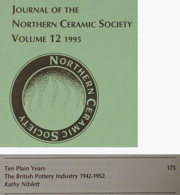
In the Journal of the Northern Ceramic Society Volume 12 from 1995 there is a paper entitled Ten Plain Years: The British Pottery Industry 1942-1952 by Kathy Niblett.

It explains the rules and consequences to the Staffordshire potteries of concentrating production to a reduced number of factories in order to save materials, energy and labour as these were needed elsewhere for the war. The process was initiated in the autumn of 1941, but by the summer of 1942 they were extended to restrict the sale of decorated pottery in the home market. Some restrictions were relaxed in 1945 and subsequent years but they were not fully lifted until August 1952.

The gist of the paper with regard to A G Richardson and Co Ltd is that in 1941 the company was designated a “Nucleus Firm” by the Board of Trade. This meant it was able to continue production at its own site, (The Gordon Pottery, Tunstall), but that the work done at the Britannia Pottery in Cobridge would be moved to Tunstall. This “concentration” of the industry was a restructuring to allow people to leave the the pottery trade to work in the armed forces or industries in demand for the war effort. Decorated pottery required a lot of man-hours and energy costs for extra firing in the kilns. These were to become luxuries generally denied to the home market, but some production would continue for sale abroad in order to earn foreign currency. The domestic market would soon get used to plain, undecorated tableware.

My understanding is that the rules were strict and even a backstamp could be deemed decoration and so the company would not be using a large number of styles at this time. Each company was allotted a price band that their ware could be sold for. Richardsons price band for tableware was "B", and one can occasionally find tableware with a backstamp accompanied by the letter B. This would indicate that the ware was made during the period of price controls from June 1942 until August 1952.


Type 481

 
Type 482

Type 481 appears to be the general style that Richardsons used during the period of the war time pottery restrictions, (1942-1952). Type 482 is the same mark but found with the letter "B" denoting the price band for tableware. They are very similar to type 471 except that the crest plumes are slightly different and there are no pierced holes in the crown beneath the plumes.

For small and awkward shaped items of Crown Ducal produced at this time the company used a modified form of  type 401 with the addition of A.G.R. which I have named type 405.

Type 405
This brings to a close my review of the backstamp styles used until the ending of the WW2 pottery restrictions in 1952. Please treat all this as my best guess. There are bound to be errors and omissions.

For post 1952 productions I have not started to record what was used on tableware. It will probably be the most difficult as there are hardly any numbered patterns with which to build a reference framework for age determination. For the fancies, we know that a new style was introduced sometime between August 1952 and the beginning of 1955, here named type 501. This backstamp will be familiar to collectors of tube-lined Crown Ducal pottery that was made after the war. Particularly the pink and grey enamelled designs, 6778, 6822, 6884, 6907, 6918 and 6927. The Pink Palermo design which carries the original 5803 pattern number and later productions of Persian Rose, 4040, Green Chain, 4298 and Golden Leaves, 4921 can also be found with this backstamp. A couple of the nursery ware patterns Who Said Dinner?, 3131 and Little Boy Blue, 3133 also continued in production and have this mark.


Type 501
As an end note I feel quite chuffed to have discovered a technique for confirming if a tube-lined piece of Crown Ducal was made whilst Charlotte was still at Richardsons or if it was made after she had left the company. Assuming Charlotte departed around the time when the the Board of Trade restrictions were introduced along with most of her colleagues, and the backstamp syle, (type 481), was introduced around the same time, and the backstamp is legible; then there appears to be a test to determine if an item was made whilst Charlotte was still an employee.

I have tested several examples, and apart from the legibility issue of smudgy backstamps, all those that I have seen with distinctive type 471 or 481 styles do pass the test. That is to say, age determination by backstamp type supports the results of other tests based on pattern, shape and the tube-lined markings. So collectors can remain calm, the discovery has not revealed any surprises. So hopefully all those ambiguous examples with the old AGR5 group style backstamp, without signatures, can have their age categorised with more confidence. Where it has proved to be most helpful is in the dating of nursery ware which rarely have base markings other than the backstamp. Also examples of the simpler designs like Circular Fruits, (5982), which often did not get marked by the tube-liner and remained in production throughout the war can now be dated more precisely.

I am open to being shown wrong. If you have an example of tube-lined pottery with backstamp type 481 with a facsimile Rhead signature please let me know. Similarly if you have a tube-lined piece with a type 471 and it has a pattern number greater than 6353 I would like to know.

The email address is on the rhead-crownducal.info website.

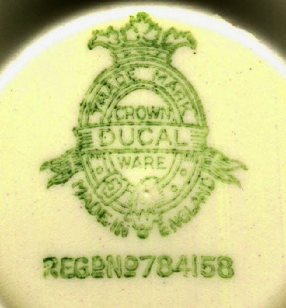
Left, type 471 Charlotte Rhead era - Right, type 481 post Charlotte Rhead era


Monday, 20 January 2014

Charlotte Rhead's design sources for Aztec (2800) and Stitch (3274)

It will come as no surprise to collectors of Charlotte Rhead pottery that it is easy to identify the inspiration for so many of her designs. Coming from a family of artists and a home full of art there would be no shortage of ideas.

It has been fascinating to follow the Rhead Cronin Collection sales at Bearnes Hampton and Littlewood where some tube-lined tiles are accompanied by pictures of the same subject painted by her father. It is wonderful to see the association of these artworks.

With regard to her Crown Ducal tube-lined portfolio there are several patterns where one can be reasonably confident of her inspiration source. Here are a few:

Primroses drawn by George Woolliscroft Rhead
  • Primula could have been modelled so easily on her grandfather’s work at Copeland. Search with Google images for CF Hurten Copeland primroses and you should find what I mean. Or perhaps from George Woolliscroft Rhead's  "Studies in Plant Form" drawings.
  • Manchu, the dragon was previously interpreted by her father when he was at Woods & Sons, but of course the Chinese version is yet much older still.
  • Blossom uses a floral style crafted in slip clay very similar to a pattern that her father Frederick designed for Liberty & Co whilst he was working at Wardles.
  • Omar, I’ll wager would have been inspired by her uncles George Woolliscroft and Louis who worked together on a project to illustrate the Rubaiyat of Omar Khayyam.

In the first tranche of the Rhead Cronin Collection sale on 17/12/2013, there were two lots that provided me with new insight into the design origins of Charlotte’s Crown Ducal designs, Stitch, (3274) and Aztec, 2800).

Stitch, (3274), design influence


Crown Ducal Stitch (3274) and Ditmar Urbach ewers.


Picture reproduced with kind permission of Bearnes Hampton & Littlewood

Lot 2 comprised of two Stitch, (3274), items and two ewers in a similar pattern by the Czech company, Ditmar Urbach. Bernard Bumpus notes the design connection between the two in the 1987 edition of his book and I have tried in vain to get definitive evidence of which design is the older. But with the Ditmar Urbach ewers in the possession of the Rhead family I feel that Charlotte probably based her design on the Czech pattern. 

Ditmar Urbach ceased to exist in its pre-war form after Germany took over the factory in 1938. This is well after 1933 when Stitch was designed, but I have been unable to determine the design date for their “version” of Stitch. Although this is all rather inconclusive the decider for me is that after Charlotte adapted the design for Crown Ducal she then adapted the shape of the ewer for her patterns at HJ Woods Bursleyware after WW2. The coincidences are too extraordinary to ignore.

If someone does have design date information for Ditmar Urbach patterns please let me know.

It should be emphasised that there is no mistaking the two productions. The glazes, shapes, backstamps, design details are obviously different when viewed side by side. Also the Czech version is not tube-lined, the stitches are thickly applied brown paint.

Ditmar Urbach style, left and Crown Ducal, right

Aztec, (2800), design influence 


Watercolours by Charlotte Rhead

Picture reproduced with kind permission of Bearnes Hampton & Littlewood

Lot 38 in the same sale were two watercolours by Charlotte Rhead of native North American women. One of the women’s clothes incorporates the stepped pyramid symbol similar to that used in her Aztec pattern pottery.

I do not know of any period references to Crown Ducal pattern 2800 and the design predates the start of the numbered surviving pattern books. Collectors prefer names rather than pattern numbers, and so the descriptions in the Bumpus books of the contemporary interest in Aztec architecture have lent the name Aztec to the design. 

Although the name Aztec is quite appropriate for the familiar design motif from the Latin American pyramids, I now believe that Charlotte was looking at North American culture and symbols rather than those from further south. Not only does Charlotte use the stepped pyramid for “Aztec”, but there is also the rare, unnumbered design with wavy lines in exactly the same colour palette and from around the same time as pattern 2800. My amateurish, quick look research on the internet finds that the stepped pyramid means “snow cloud” and the wavy line symbol means “running water”. 

Charlotte Rhead Crown Ducal 12" charger Aztec, (2800) with Snow Cloud motif

Charlotte Rhead Crown Ducal shape 148 unnumbered design with Running Water motif

If further evidence is required that Charlotte was thinking about native North American culture. Then study of the Crown Ducal pattern books reveals that pattern 3594 is a 17” Cotswold shape supper tray, (17” charger), enamelled with the profile of a native North American  chief. And there’s that stepped pyramid symbol again in the feathered headdress band.


Central design for Crown Ducal pattern 3594

Friday, 25 October 2013

Crown Ducal Period Advertising

Period advertising material for Crown Ducal can be found online in projects that are scanning old newspapers. I found hundreds of examples within a few hours searching, but the majority are not explicit about the pattern and so are of no real value, but I do believe this could be useful resource to help with the production history of Crown Ducal ware.

The main surprise for me was for how long the popular patterns remained in production. One always felt that the well known patterns, Red Tree, Sunburst and Bristol had long production runs, but if one takes the advertising at face value there could have been quite a few designs that Richardsons were able to rely upon throughout the 30s, 40s and 50's. 

Here are a few observations that caught my eye.

Lithograph Rosalie on Florentine tableware shape, ivory glaze & gold edge


Rosalie on Florentine shape, ivory glaze and gold edge
Quite a common pattern and easily found at auction but I never knew how old the design was. The standard Rosalie on Florentine shape, ivory glaze with gold edge is not recorded in the surviving pattern books. The transfer, (made by Ratauds, No.6319), is known to exist from the early 1930s because it exists with other shapes or glazes. There is publicity material for Rosalie in a trade magazine from 1955 but the Florentine shape itself dates to about 1930. There was always the possibility that Rosalie on Florentine could have been either a post war introduction or date to early 1930’s but it is great to have found the evidence of its long production history.

Advertisement in The Binghampton Press 5 October 1943

So far I have found advertisements for Rosalie in the:

Albany (New York) Evening News 2 June 1933
Leader Post (Regina) 15 October 1935
The Binghampton Press (New York) 13 May 1940
The Binghampton Press (New York) 30 April 1943
The Binghampton Press (New York) 5 October1943 (illustrated)
The Knickerbocker News (Albany New York) 6 June 1945
The Binghampton Press (New York) 13 July 1945 (illustrated)
The Binghampton Press (New York) 29 September 1949
Pottery and Glass April 1955
Western Herald (NSW) 20 July 1956

The June 1933 advert is significant because the pattern books start at pattern 2900 which dates to May 1933 and so the pattern probably predates the start of these documents by a few months or a year. Therefore there is good evidence that the pattern remained in production for almost 25 years, (possibly longer).

Empress pattern (4746) on Avon shape tableware


The advertisement shown above with Rosalie also promotes the Empress pattern. This is a design with a known pattern number, 4746, which dates to the summer of 1936. It is one of the earliest popular designs that Crown Ducal created with a rich coloured band on the Avon shape and with gold coloured detailing and floral transfers. The same design was also made with a maroon, (deep pink), band as pattern 4745 and a green band as pattern 4747. I believe the name Empress was used for all three colour versions. The floral transfer was made by the Universal Transfer Co. Ltd. (litho number 8944). For Crown Ducal patterns it is referred to as the Yukon litho after their first pattern that used it. 

Empress pattern 4746 on Avon shape tableware
Advertisements for the Empress pattern have been found in the:

The New York Sun 2 February 1940
The Binghampton Press (New York) 13 May 1940
The Binghampton Press (New York) 19 February 1943
The Binghampton Press (New York) 5 October 1943 (illustrated)

Charm pattern (1790) on Gainsborough shape tableware


The Charm pattern is the third design illustrated in the above advertisement. This is the oldest design of the three and is one of the earliest, and most popular patterns on the Gainsborough shape. The lithograph decoration was made by the Universal Transfer Co. Ltd., (litho number 7506). From the dates of the advertisements Charm remained in production for at least 15 years. There is a mystery why examples of Charm are numbered with 1790 as do references to the design in Crown Ducal documents. But Richardsons own publicity for the launch of the pattern in the Pottery Gazette of 1930 labels it as pattern 1768, (or perhaps there is a minor design difference between the two that I am missing).

An example of Charm, 1790


Advertisements for the Charm pattern have been found in the:

The Pottery Gazette and Glass trade Review 5 February 1930 (illustrated)
The Binghampton Press (New York) 16 October 1930
The Montreal Gazette 19 October 1934 (illustrated)
The Rochester Chronicle 27 January 1937 (illustrated)
The Binghampton Press (New York) 12 January 1940
The Vancouver Sun 9 December 1942 (illustrated)
The Binghampton Press (New York) 9 July 1943 (illustrated)
The Binghampton Press (New York) 5 October 1943 (illustrated)
The Binghampton Press (New York) 13 July 1945 (illustrated)

Advertisement in The Montreal Gazette 19 October 1934

The George Washington bicentenary commemorative plates of 1932


A series of twelve plates made for the USA market in celebration of the Washington bicentennial. Two feature articles have been found discussing the home furnishing memorabilia available including the Crown Ducal plates.

An example of a Washington bicentenary commemorative plate

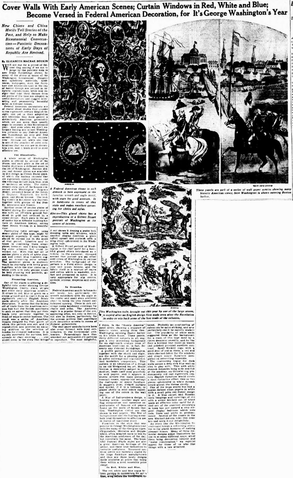
Feature article in the New York Sun 25 January 1932

The feature in The New York Sun of 25th January 1932 includes the following text relating to the plates:

A whole series of Washington plates is offered by several of the stores, and each plate in the set of twelve illustrates a different event in the life of Washington. Service, dinner and dessert plates are available in this design in Crown Ducal ware, of which the borders recreate fine old eighteenth century patterns, and the colorings include dark blue, pink or mulberry on white. The center scenics show each of the houses connected with Washington Sulgrave Manor, ancestral home of the family in England; Wakefield; his birth place, and Mount Vernon. The leading events in his career are depicted, together with groups of his family, associates and friends.

Feature article in the Brooklyn Eagle Magazine 21 February 1932

A full page article in the Brooklyn Eagle Magazine of 21st February 1932 has an illustration of one of the plates and discusses the themes thus:

Another patriotic textile is somewhat broader in scope, beginning with the landing of the Pilgrims and including the boston Tea Party and Betsy Ross at work upon the flag; also reproducing the famous "Spirit of 76" and Washington Crossing the Delaware". Leutze's great painting is one of the most frequent designs to be met amongst the bicentennial decorations, as in spite of the outbursts that come now and then from some art critic denouncing the great achievement as bad art, or from a matter of fact sailor who rails against the possibility of a rowboat holding so many people and the impracticability of the father of our country standing in such attitude under such circumstances, the famous picture continues to be the symbol of patriotism and courage for Americans.

It is one of the twelve patriotic designs imprinted upon a set of Crown Ducal plates, one of the modern Staffordshire wares. And here again history repeats itself as the idea of featuring American scenes and symbols upon chinaware was first adopted by the Staffordshire potters immediately after the Revolutionary War as a means of capturing the American trade. All feelings of animosity engendered by the war were put aside in the interest of business. And upon the "Old Blue" Staffordshire ware - the tableware of early America and one of the most prized subjects of Americana - was to be found patterns representing American scenes, episodes from American history, and the likenesses of our national heroes.

In the same -colors, today - the blue, the mulberry and pink – as a century and a half ago the new Staffordshire pottery repeats itself. And among the new designs on the patriotic plates we see reproduced famous paintings and prints, "Surrender of Cornwallis." "Washington and his mother." "Adams proposing Washington as Commander-in-Chief." "Washington and His Family." also views of Mt. Vernon, Wakefield, his birthplace, and Sulgrave Manor, the ancestral home of the Washingtons in England.

With dated commemorative plates they end up in the sales the following year. Here is an example from the New York Sun in 1933.

Advertisement in The New York Sun 15 February 1933

The twelve designs in the series are titled:
  • Surrender of Cornwallis
  • Washington and Lafayette at Mount Vernon
  • John Adams Proposing G Washington as Commander in Chief of the American Army
  • Washington at Trenton
  • Washington crossing the Delaware
  • Washington’s Headquarters Morristown NY
  • Washington and His Family 
  • Washington and His Mother
  • Mount Vernon
  • Washington at Valley Forge
  • Birthplace of Washington at Wakefield
  • Washington Ancestral Home
Images of all the plates can be found on the New York Historical Society website


Two Queen Anne shape designs, Melrose and Vine and Charlotte Rheads Rialto and Belfast designs on Cotswold shape.


The Queen Anne shape with fluted moulding was always more popular in the USA than the UK and here are a couple of lithograph designs with ivory glaze that were mentioned in the advertisements. Vine, 3566, was designed in early 1934, and Melrose, 4041, is from the end of 1934. The Vine lithograph was made by the Universal Transfer Co. Ltd, No. 8535 and the Melrose litho was made by Ratauds.

Platter in Vine, 3556 and coffee cup in Melrose, 4041

Advertisement for Vine in The New York Sun 5 December 1934

Advertisement in The Binghampton Press 28 January 1937
The advertisement for Melrose is not illustrated with the Crown Ducal patterns but is still useful as it tells us that the design was on sale and probably in production for around 3 years. A similar production period would to apply to the other designs mentioned, Rialto, 3140 and Belfast, 3154, which are probably Charlotte Rhead designs from late summer of 1933.

Top Belfast , 3154 and below Rialto, 3140
It has been interesting to link recent images of Crown Ducal pottery to the period advertising and fortunately there is plenty of scope to revisit the subject with more patterns in a future post. 

Wednesday, 4 September 2013

W. B. Johnson - Art Director 1861-1943


A Biography of William B. Johnson

Art Director for A.G. Richardson & Co. Ltd 


As an enthusiastic collector I enjoy being able to use this blog to post information about Crown Ducal and Charlotte Rhead pottery. Predictably it will be mostly to report on new discoveries, to share previously unpublished information and any ideas or observations that add to the documented history of A. G. Richardson & Co. Ltd.

This post is different because it is not so much about pottery, but about a person, Mr William Borer Johnson who held the post of art director at A. G. Richardson & Co. Ltd from 1918 until he retired in 1938.

Little is known about the company and the people who worked there. We have the books by Bernard Bumpus focusing on Charlotte Rhead and the dissertation by Gerrard Shaw from 1993 on the Crown Ducal tableware production during 1920-1940, (hopefully soon to be published as a book). Apart from those sources we are left with searching through fragments in trade journals and other publications of the period. The Potteries Museum and Library in Stoke on Trent are custodians of the some surviving Crown Ducal pattern books but these are not easily accessible to most, and they do not contain much helpful information about the company itself or the people who worked there.

So it was quite a thrill to be contacted by Douglas Johnson, the grandson of William. He has kindly made available the documentation, newspaper cuttings and family history to be able to compile this biography. All the important content has been provided by Douglas and I am just happy to have been able to help publish this piece Crown Ducal history.

William Borer Johnson

A grandfather remembered


Will Johnson was not born of artistic parents. He was the third child of John Johnson, a tailor of Longton, Stoke-on-Trent and Frances Turner, a farmer's daughter from Alfold in Surrey. The rest of the family were Selina, Emma, Francis, Albert and Eva Sophia his paternal grandfather was Thomas Johnson, a coal miner from Audley, North Staffordshire.

As a boy I used to wonder where Grandpa got his "funny" middle name from. In fact it came from Frances Turner whose grandfather was William Borer, an apothecary and surgeon from Rusper in Sussex. He was a kind and gentle man who once gave me a book of Omar Khayam's poems inscribed "the pen is mightier than the sword". 

He married in 1884 Eliza Ann Copestake, (who descended from a long line of potters). He was described as a china flower painter and she a paintress. They had four children, Frances, Adelaide, Mabel and Frank, (my father). He was a keen bowls player, and a past captain of Wolstanton Bowls club. 

He loved story telling and used to talk about his days as an apprentice. One evening working late with a colleague clearing up the mess in the decorating shop and tipping the various waste into a drum containing slip, they decided to have a joke on a policeman who was having a quiet smoke beneath their first floor window and pour a sample of the slime over him. Just as they thought they had got away with it, the multi coloured bobby appeared and arrested the pair of them which proved to be very costly.

He told me that as a student at Stoke Art School he would walk both ways from Longton until what was eventually called the main route through the six Potteries towns was served by horse buses.

He had a quiet but mischievous side to him and when sitting in his favourite arm chair smoking one of his many pipes and reading a newspaper he would feign deafness with a wink of an eye as Grandma shrieked "Will".

Will Johnson was a modest self effacing man whose life was his work and it doesn't surprise me that he didn't leave much evidence around of his 58 years continuous service to the pottery industry. As well as being a fine artist he was an accomplished water colourist, occasionally giving paintings to his friends, generous to a fault and a lovely man to have as a grandfather. His favourite colour was vermillion, and when he gave me his old paint box it was the one tablet almost gone!
Douglas Johnson 2013

The two sides of WBJs "apprentice piece" probably dating to 1882


William B. Johnson 1861-1943


1861   28th February. Birth of William Borer Johnson at 65 Caroline Street, Longton. He lived there until his marriage in 1884.
1875    Apprenticed to William Slater at Harvey, Adams & Co, Longton and a student at Stoke-on-Trent Art School
1882    Joins Doulton to work under John Slater as a flower painter at Nile Street works, Burslem, and progresses to have charge of one of the decorative departments at Doulton & Co. Ltd.
1884    Marriage to Eliza Ann Copestake
1885    Residing in Church Street, Fenton
1900    Residing in Lorne Street, Burslem
1911    Residing at Vale View, Porthill, Wolstanton
1925    Residing at 23 Albert terrace, Wolstanton
1918    Joins A.G. Richardson as Art Director
1931    Residing at 22 Marsh Avenue, Wolstanton 
1931    William is honoured with 70th birthday celebration by the company and his work colleagues
1938    Retirement
1943    Dies at the family home in Maybank, Newcastle under Lyme


Pottery art director honoured


To demonstrate the high esteem in which William Johnson was held by his employers and work colleagues, the Tunstall town hall was hired for his 70th birthday party. Entertainments included whist drive, catering and dance orchestra.

The event was recorded in the local paper, The Evening Sentinel edition of 30 March 1931 and The Pottery Gazette and Glass Trades Review, May edition. The following text in italics is how the Pottery Gazette described the event.

POTTERY ART DIRECTOR HONOURED.—At Tunstall Town Hall on March 28, to mark the attainment of the seventieth birthday of Mr. W. B. Johnson, art director to the Gordon Pottery of A. G. Richardson & Co., Ltd., a whist drive and dance was held, at which two notable birthday gifts were presented to Mr. Johnson. These gifts took the form of an all-mains wireless set presented to Mr. Johnson on behalf of the principals of the concern (Mr. John Rushton and Mr. J. Harrison), and an easy chair, the gift of the employees. Several speakers took part in expressions of warm affection for Mr. Johnson, numerous references being made to the pronounced ability which he has brought to bear upon his work at the Gordon Pottery over a long period of years. Mr. Rushton said it was a great joy to him when he learned that the staff had decided upon making a presentation of their own, for this showed that not only were Mr. Johnson's qualities and abilities recognised by the directors and administrative staff, but by the employees throughout the factory. They all knew the difficulty of bringing out new patterns and designs, and in this connection Mr. Johnson had, no doubt, had disappointments as well as successes, but by the latter he had helped to place the Gordon Pottery in the high position that it now occupies in the estimation of the whole industry. Mr. J. Harrison, supporting, said that there was only one regret that he entertained that evening, and that was that he had not been brought into contact with Mr. Johnson earlier than he was. Mr. Johnson, returning thanks for the gifts, said he could safely say that the last ten years had been the happiest of his life. If a man at the age of seventy had the affection of his fellow-workers and the confidence of his employers, he could hardly wish for more.

It is interesting to recall in connection with an event of this kind that Mr. Johnson, the recipient of the gifts above referred to, who was apprenticed to painting in his early days at Longton with Mr. William Slater, was subsequently in charge of one of the decorative departments at the famous Nile-St. Works of Doulton & Co., Ltd., where he came into close and personal contact with many famous artists, amongst whom may be mentioned Mr. C. J. Noke, John Slater, Edward Raby, Robert Allen, David Dewsbury, John Hugh Plant, George White, William Hodkinson, Herbert Betteley, and Joseph Hancock. It is good to be able to look back upon such associations and all that is implied thereby. It only remains to be said that Mr. Johnson is not retiring. This was no valedictory function; its purpose was to enable Mr. Johnson's friends and colleagues to show to him, whilst he remains in full harness, what a lot they think of him.


An example of WBJs work at Richardsons


One of the most frustrating aspects with having so little AGR company documentation is that we do not really know who designed what. We attribute all the tube-lined designs to Charlotte and also give her credit when the same motifs turn up in plain enamels. But what of WBJs contribution? It is difficult, we know he was an accomplished flower painter, but Richardsons did not produce expensive hand painted items, their stock in trade was print and enamel, lithographs and relatively simple freehand floral and band and line decoration.

We do have one design element that we can definitely attribute to William Johnson and that is a lithograph that the company refers to as "Roma".


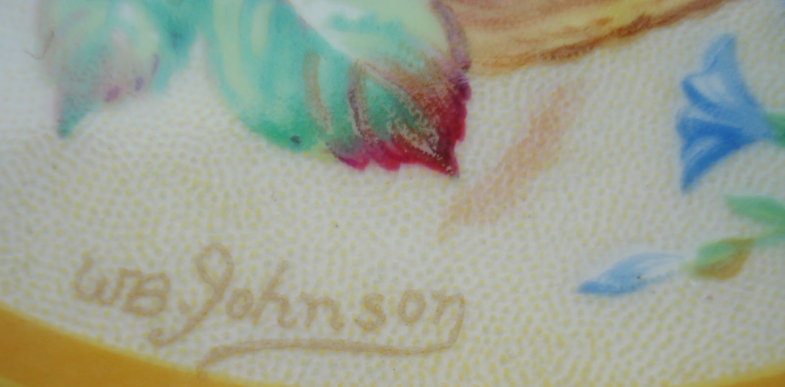
The "Roma" lithograph with W B Johnson signature


Detail of signature on "Roma" lithograph

The lithograph centre incorporates the signature of WB Johnson and so it is beyond doubt that William painted the original artwork of this floral arrangement in a basket. The painting would then be made into a lithographic design for the company to use for its various patterns. At least thirty Crown Ducal designs are known to have incorporated this particular lithograph which was named “Roma” by the company.

Collectors will actually find more than thirty different styles using this centre transfer because the Crown Ducal fashion at this time was to produce each design in several colours for their Avon tableware shape. So, one of the more common patterns, 5080 can be found in solid colours blue or green and in the powder colours blue or green. It would not be a surprise if examples appear in solid maroon, ivory and powder pink as well as these were all used for similar tableware patterns.

The lithos, or transfers were not made by the Richardson’s but by specialist companies such as UTC, Ratauds, Butchers and Chromo. The Crown Ducal pattern books record that WBJ’s floral painting was made into a lithograph by the Universal Transfer Company Ltd. and given the number 8864. The documents refer to the litho as either UTC 8864 or the name Roma. As the Richardson’s art director, WBJ would probably have been responsible for working with these external companies to oversee the production of proprietary Crown Ducal lithographs as well as selecting “off the shelf” non-proprietary transfers.


Service plate in pattern 5313, maroon

The pattern number is either 4951 or 5313, they are both the same design and are recorded as duplicates in the Crown Ducal pattern books.


4951 is annotated with:

  • Blue band underglaze
  • Best gold bands & line
  • 4116” - litho
  • Gold print
  • Service plate
The description for pattern 5313 adds no further information.


Service plate in pattern 5313, blue

This design is known to have been produced in at least three colours, blue, maroon and green. The plates are 101∕2” in diameter with 41∕16” diameter lithograph centres. Several sizes of the transfer would have been made, large ones for plates down to the smallest for the centre of a saucer. Although for this particular design only service plates were made, but they may have different size lithographs, some have a smaller centre with a diameter of 31∕8.

The design dates for 4951 and 5313 would be around November 1936 and February 1937 respectively. However, the earliest known pattern incorporating the lithograph is 4830, (a design with Charlottes snow glaze), from about August 1936 and so WBJ’s original artwork must have been painted in the early summer of 1936 or sometime before then. 

The patterns 4951 and 5313 are applied to “service plates”. These were attractive place setting pieces to decorate the table at its best before dining, they were not intended to be eaten from. Crown Ducal is earthenware, not fine china, but the finish of these plates is higher quality than their standard tableware so it is quite possible that the company used this design to show off how close to fine china they could make their earthenware. This idea is supported by the base markings on the pair of examples shown which both have inscriptions in gold indicating they were made as souvenirs for dignitaries when the factory was visited by a member of parliament. It should be recognised that WBJ’s own artwork is to be found on Richardson's highest quality productions and that the company used the design for presents and promotional material.


Base markings of blue service plate

Hopefully, one day, it will be possible to document more of Williams designs because from the tribute at his 70th birthday party he must have made a significant contribution to "bringing out new patterns and designs" from the Gordon Pottery.


The friendship between William and Charlotte Rhead


Bernard Bumpus in his books on Charlotte Rhead rather skims over the relationship between William Johnson and Charlotte Rhead as if this might be an awkward subject. He being the elder, in post, art director and Charlotte being the prize catch designer of tube-lined ware. 

What we now know is that WBJ knew both Frederick and Charlotte Rhead very well and that Charlotte was a close friend of Mabel, (WBJs daughter), who always referred to her as Cissy Rhead. Their association went back many years, long before Charlotte joined Richardsons. The families lived a few doors from each other in Marsh Avenue, Wolstanton. In fact the Rheads moved to Marsh Avenue in the same year that WBJ started work at Richardsons in 1918. WBJ was present at Frederick Rheads funeral in 1933 as Richardsons company representative, but he was also there surely because he was a family friend.

Obviously when Charlotte joined Richardsons after her break with Burgess & Leigh Ltd, it was a huge boost to the company's decorating department and WBJ probably had a hand in guiding her towards the company. Mabel is remembered as being quite sure that WBJ was involved in securing Charlottes appointment.

William Johnson retired from A. G. Richardson & Co. Ltd in 1938 and we have evidence that there was an enduring friendship between William and Charlotte after he had left the company. We know this because Charlotte made at least two personalised tube-lined gifts to William. The gifts are not dated but they both have unique stylistic characteristics which can be dated from known Crown Ducal designs.

The first is a pestle and mortar with W B JOHNSON tube-lined around the interior. The text style is exactly the same as that used for the lithographed commemorative design created for the royal visit of George VI and Elizabeth to Canada during May-June 1939. (Crown Ducal pattern 5814). That text style is not used on any other Crown Ducal pattern and the commemorative ware would have to be produced  and shipped to Canada prior to the visit. This would have been around the same time as Williams birthday at the end of February 1939.

Personal gift from Charlotte to William probably for his birthday in February 1939

The second gift is tube-lined smokers set of a lidded box and four ash trays. The design is a modified version of pattern 6010 to incorporate the WBJ monogram and with a border in gold. The other gold embellishments of dots around the lid edge and the line on the ashtrays are also modifications to the original design. The pattern 6010 has a design date of around Christmas 1939 or New Year 1940, and this would be the best estimate for when the idea for this gift was conceived. To tube-line the slip to form the whole design, (rather than use lustres and enamels), was a method that Charlotte used for many of her designs, especially her early years at Richardson’s around 1933/4 for USA salad bowls and platters. Later, in 1937, she experimented further with techniques such as sponging the coloured slip clay. This design for this gift appears to be crafted with a blend of both these techniques and was probably made for Williams birthday in February 1940.

Personal gift from Charlotte to William probably for his birthday in February 1940

Other work by the artist William B. Johnson


Although the focus of this post is to acknowledge William as the art director for Richardson & Co. and the decorating manager of the Gordon Pottery we should be mindful of his work from many years at Royal Doulton and his output of watercolours for his own satisfaction. So if you happen to find this blog whilst researching the WBJ mark on your item of Royal Doulton, or have found the signature of W B Johnson on a watercolour, you will now know more about the man who painted it.

A pair of Doulton vases marked with WBJ
Picture courtesy of 1818 Auctioneers
http://www.1818auctioneers.co.uk/sales/lot/47423/96/162

Watercolour by William B. Johnson